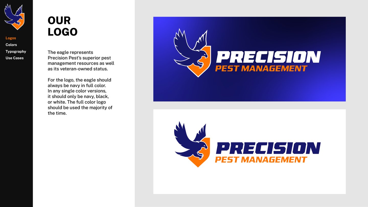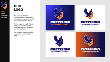
Precision Pest Management had reached out wanting an updated brand and logo. When looking online, there were many brands with red and green colors — each logo featuring some variant of an insect.
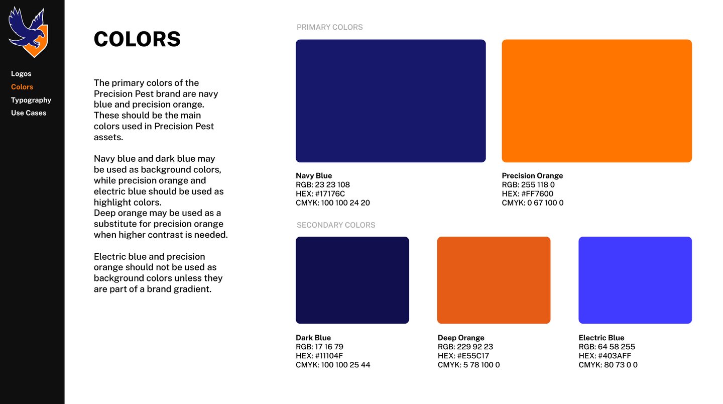
To help distinguish their brand, we used a blue and orange color palette. We also came at the "pest management" side from a different angle — birds are insects most dangerous predator. As such, we centered our logo designs around incorporating a predator bird in each design. The client also wanted to incorporate a shield in the design to emphasize the superior protection they provide.
Precision Pest Management
Branding | Logo Design